I worked on a logo for a friend opening an art gallery - what a roller-coaster, but ultimately a great lesson in communication skills.
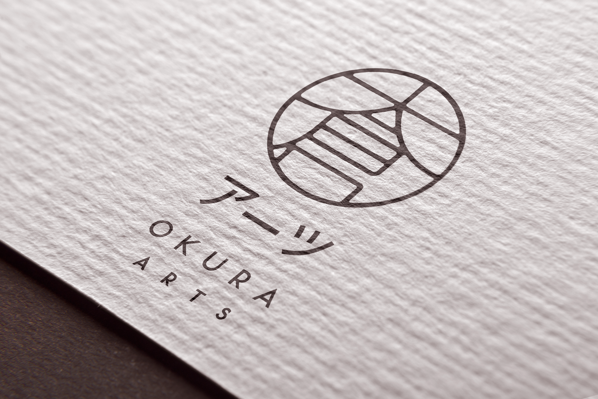
Originally, I was asked to create a japanese-looking logo from the name Okura Arts 大倉アーツ - I had a lot of fun researching that and was happy with my first fusion of the ideograms 大倉 (Okura - which basically means warehouse) using the common top and bottom parts of them, forming a rooftop.
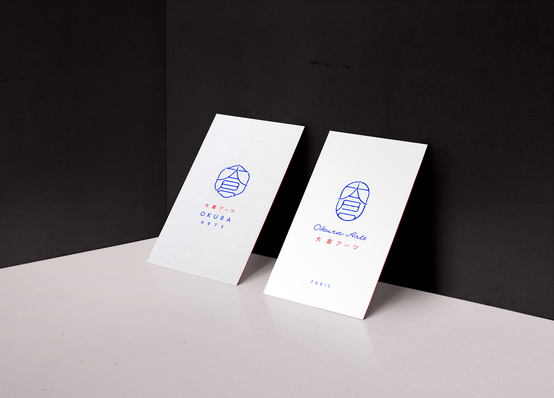
Of course, the enthusiasm was short-lived when her undecisive partner decided she wanted something "frenchie" and not japanese instead. Their studio is actually based in Paris, but selling mainly to the Japanese market, which is why she wanted it to feel french.
This took us on a journey between Japan and France, with all sorts of variations until we reached a compromise.
Two very different directions.
Trying to avoid an Eiffel-tower logo disaster that she asked for, I tried suggesting the tower through the ideograms still, using the A looking part of the symbol. Other ideas : suggesting frenchness through colors, or using the hexagonal shape of the country in the logo.
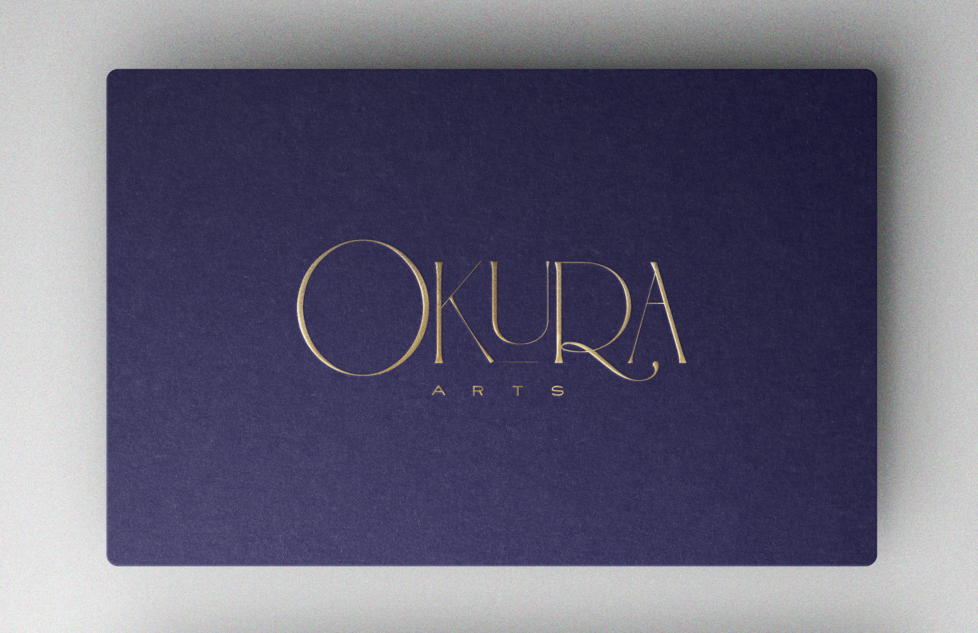
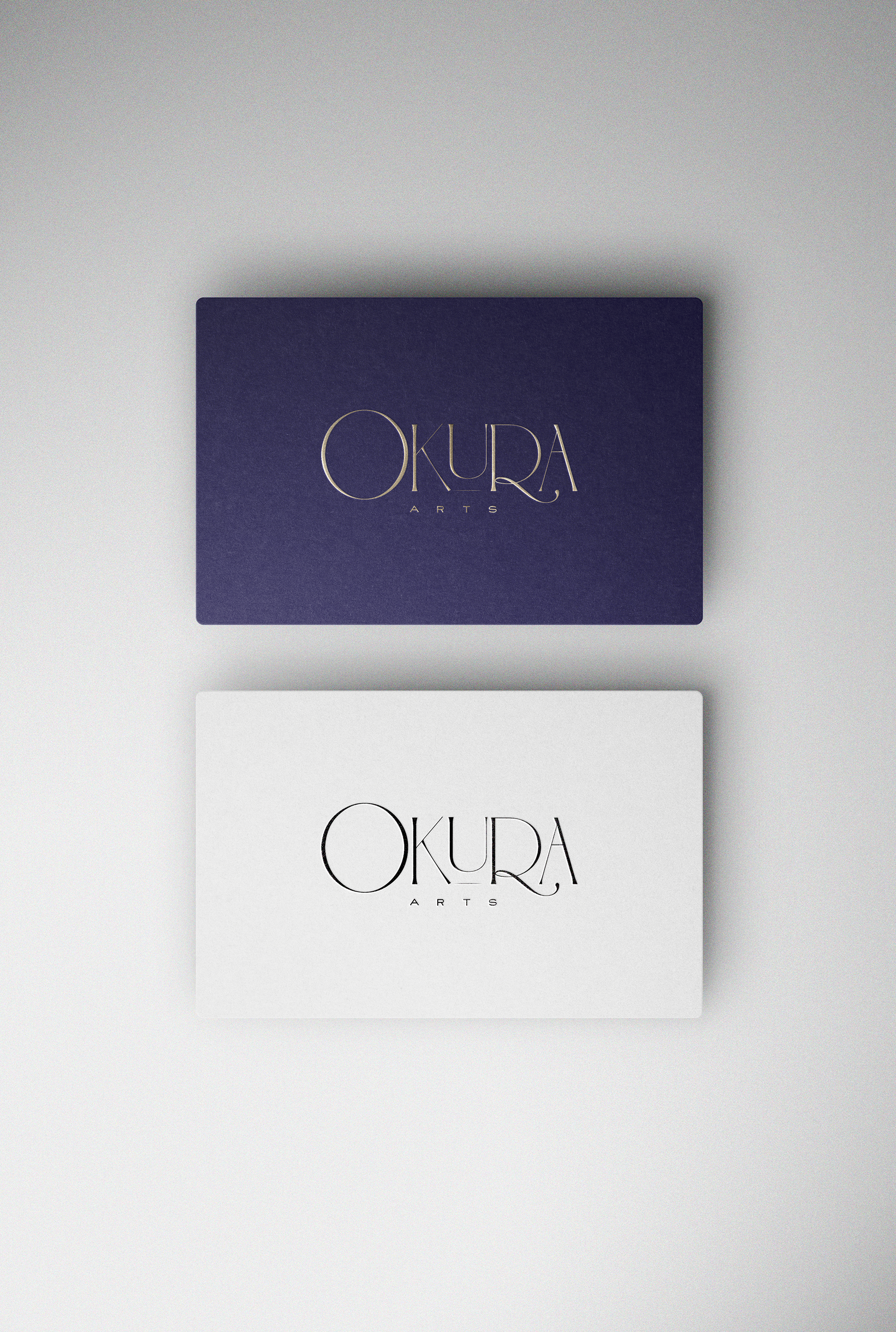
When she suddenly asked for an Art Nouveau style and wanted to scrape the ideograms altogether, I knew steering clear of kitsch would be my main challenge. I happily surprised myself with the result.